Longtime readers might notice this site looks a bit different today!
Thanks to the handywork of designer/developer (and new Indy Hall member) Melody, I’ve launched the first refresh of my site in over 4 years and the very first version ever with a completely custom design. Woohoo! 🎉
Besides a new look and feel 👀 this redesign comes with a pretty major cleanup and overhaul of my archive of articles about coworking, community building, and business.
Personally, I’m most excited to have a way to help people find the exact articles they’re looking for without having to spelunk through hundreds of articles spanning over a a decade and a half!
Here’s a few things we did to make this site better than ever before:
1. Cleared out a lot of old, irrelevant posts, and cleaned up many others
This site started out as a personal blog, more of a public diary of the things I was doing, thinking, learning, etc.
I started blogging before Twitter and Facebook were big enough to be a part of our daily lives, so in a way, many of my earliest blog posts were more like the way we use social media today: random thoughts, rants, things I thought were funny or interesting, links to things I was reading, etc.
As fun as it was to take a trip down memory lane and see an early proto-version of my professional self forming, most of these posts aren’t really useful to anybody but me (and worse, could potentially confuse readers or even harm the way I show up in search engines since these old topics are all over the damn place).
So I removed a lot of them. I kept them for my own, of course, but they didn’t need to live here.
One thing I was careful NOT to remove were old posts that included thoughts, events, and experiences that would later inform the creation of Indy Hall and all of the work I’ve gone on to do since. These early posts still exist on the site, and soon, will be a part of a curated “History of Indy Hall” collection!
Over the next few months, I plan to continue cleaning up the remaining articles - that includes improving/fixing formatting and even updating some articles to have clearer, more focused contents.
2. Color Coded Categories
I’ve never been consistent with my use of categories and tags on my blog, until now.
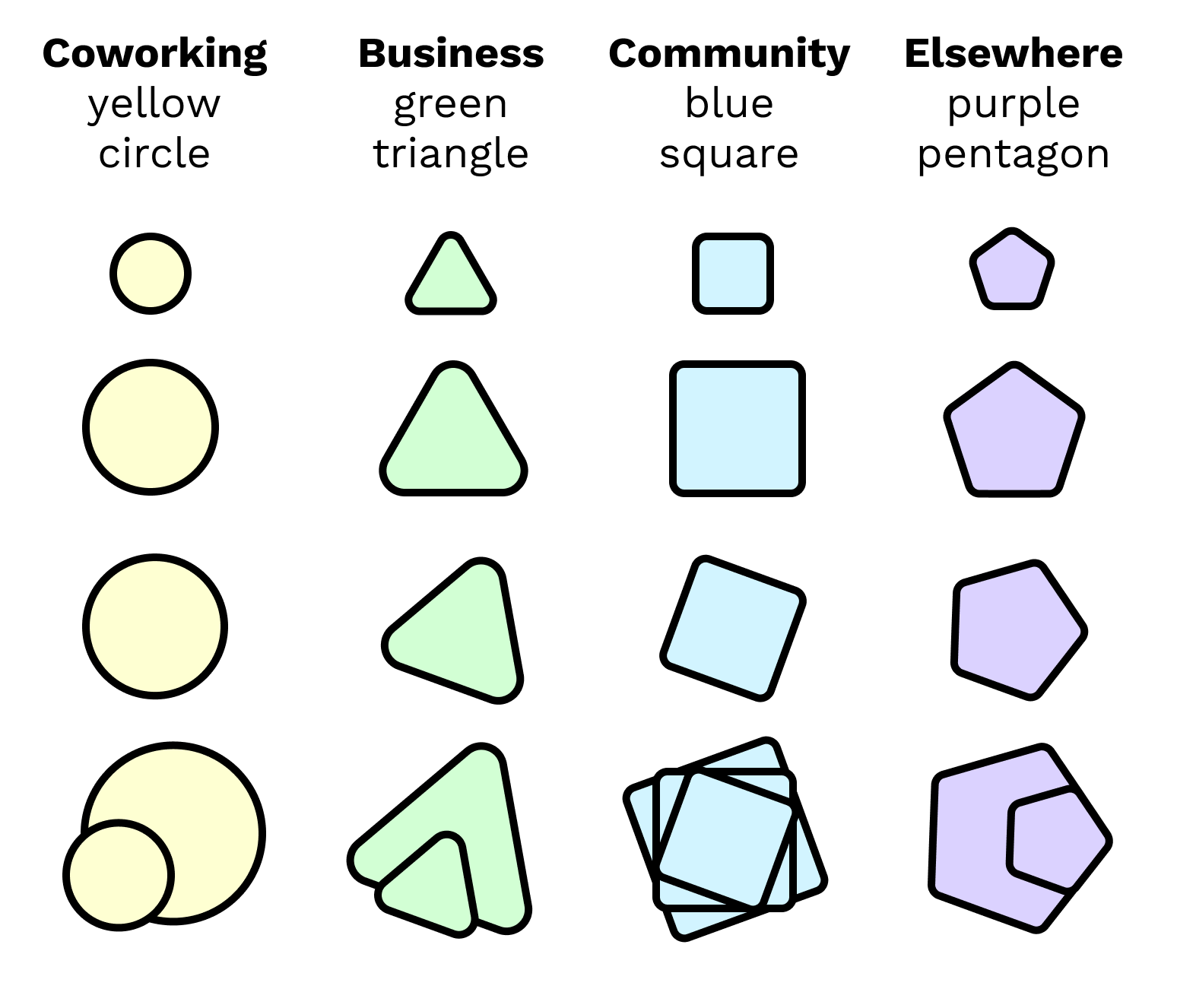
Starting today, every post is organized into a high-level category of coworking, community, business, or elsewhere.

This article, for example, is an “elsewhere” post. It’s meta!
Some posts live in more than one category, of course. But the key is knowing at a glance roughly the kind of article you’re looking at.
These colors show up throughout the site for consistency, hopefully making it easier than ever to spot the kinds of articles you’re most interested in!
3. Organizing my greatest hits into “Field Guides”
I typically write things down either as I experience them, or when people ask a question and I realize that my answer could be useful to others.
As a result, I haven’t had all of my “ideas” in any particular order. In some cases, a “good idea” is actually spread out across several posts.
But there’s no way for you, dear reader, to know the best place to start or continue.
So on this new site, I’ve started curating “Field Guides.” Each Field Guide is a collection of articles related to a theme, a problem area, or an overarching idea.
Each article in a Field Guide can be read individually and often provide a quick, relatively specific answer. Field Guide collections can help you get the bigger picture understanding across all of the individual pieces of advice.
At launch, these guides may look a little sparse, but in the coming weeks and months I’ll be filling them out more!
4. Getting to know YOU
As more and more people have been finding my site, it’s been tougher to know who’s reading and who I’m helping (and who I can help more)!
So you may notice a little “survey” or quiz showing up around the site asking you to share a little bit about who you are. You should only be asked once and then never bothered again.
It’s totally optional to answer this quiz, but if you do, it’ll help me point you towards resources (old and new!) that are most relevant to you, and avoid interrupting you with updates about things that aren’t relevant or helpful.
Most importantly: your private info stays yours, and private. I’ll never sell or share anything you share with me. It’s just to help me continue making this site a valuable resource for the people reading it!
While I continue to tune up and refine the back catalog (and add more field guides to help you find what you’re looking for), I’m also excited to get back to publishing here more regularly overall.
As I mentioned earlier in the post, I realized that I still publish a lot (literally thousands of words a week). But it’s on Twitter more than anything else. The problem, of course, is that nobody’s going to go back through my Twitter archives to find the good stuff.
Related, the comments on my blog posts have become primarily a source of spam and self promotion, making comments as a “feature” far less useful. Twitter (and sometimes certain Facebook groups) is where I find myself interacting with people around the ideas in my articles instead, which is both enjoyable and productive.
So my plan is to continue using Twitter as a place to interact and develop ideas, and then bring those ideas back here to my site with expanded thought, references, and a sense of permanence. If you’re not on Twitter, I’m always up for getting an email as well!
So that’s the deal. I’d love to hear what you think!
And don’t forget to take the quiz - it just takes a second, I promise.
Lastly, one more BIG thanks to Melody for their work on this redesign! Hire them, they’re great.
 I am always thinking about the intersection of people, relationships, trust and business. I founded