For 9 years, we built the iconic and vibrant Indy Hall community and workspace on top of spaces that had been built for someone else. Those spaces had a lot of charm, but especially in our previous space, we spent a lot of time working to make the space work for us.
Indy Hall’s first and second locations were essentially move-in ready. We made some minor improvements, ran network equipment, set up desks, and our community got to work.
We slowly modified them to our liking, making incremental improvements as much as we could. Sometimes we were constrained by budget. More often we were constrained by the reality that the building was the way it was.
Then in 2016, we signed a lease on a new building. And for the first time, we got to design our own “perfect” workspace space from scratch. We could solve the problems that had plagued us in previous spaces, and make improvements that we had only ever dreamed about before.
But when you’re designing workspace for dozens or hundreds of other people, the stakes are even higher than when you’re designing to your OWN preferences. I think that’s a part of why most office designs are so bad: designing for averages means your results are going to be, at best, average.
In my experience, most new coworking spaces obsess over small things that are relatively non-permanent. Paint colors. Furniture and layout. Even building walls (or tearing them down) is relatively cheap in the grand scheme of things.
And then there’s lighting.
Next to flooring, lighting is likely to be one of the biggest single line-items of your fit out budget.
And like flooring, workspace lighting posesses 3 unique properties:
- it’s expensive the first time
- it’s even more expensive to change if you get it wrong
- it’s MOST noticeable when it’s done poorly.
We’ve all been in workspaces where the lighting just feels shitty. Our previous spaces did not have great lighting.
But in those spaces I could blame the person who came before me. This time, it was on me to make the decisions. If I fucked it up, I couldn’t blame anybody else.
And since I was about to spend a new Toyota Camry’s worth of money on lighting, I really wanted to get it right the first time.
**Thankfully, I was able to scrap together the help to learn the ins and outs of effective lighting design, why most offices lighting design is painful and oppressive, and how to do it all on a budget. **
In this article I’m going to share a bunch of those lessons, and the specific decisions we made along the way.
One important caveat before I get started…
It’s basically impossible to give direct advice on how YOU should budget without seeing the floorplans and even photos of the space itself. If you want help tailoring this advice to your own space (new or renovated), email me: [email protected] and we can set up a design review consult!
Oh, and ironically, I don’t have great photos of the lighting in action 😂 that’s coming soon with a revamp of our website. But you can see how it looks/feels in the background shots of this recent business profile video of one of our members:
Things started out pretty rocky.
I had a really hard time getting useful advice from folks who had lots of experience with lighting for “traditional” offices. Electrical engineers, architects, and designers all gave me tips that just didn’t add up to me.
It seems like the lighting design for most average workspaces tends to be based around two assumptions:
- brighter is always better
- desks and workspaces are bolted down and won’t ever change location (lol)
I kept noticing lighting design that was both inflexible, and gave off what I can only describe as “office vibes.”
I’d never light my home the way these offices are lit.
I firmly believe that the best coworking spaces create spaces that feel as comfortable as working from home…but are more productive and professional.
Lesson #1: Lighting Designers Have Different Specialties. Choose yours wisely.
Believe it or not, the best design advice I got was from someone whose primary experience wasn’t office lighting design…but theater lighting design.
He really thought about how lighting impacts moods, how people move through space, etc. He also had a lot of experience adapting this knowledge to creative lighting installations.
Most importantly he totally understood what I was trying to achieve in terms of a lighting experience and that we still needed lighting that would be good for working under.
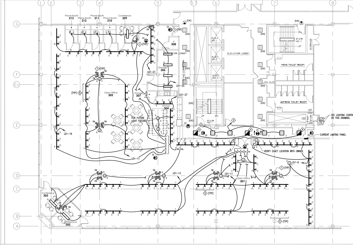
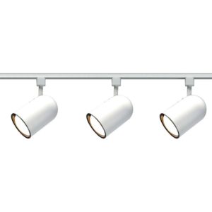
To maximize flexibility, the bulk of our primary lighting source are a standard (white, in our case) 3 wire “h-style” track system, which we laid out like this.

Now, this diagram is a little tough to understand at if you don’t know what you’re looking at, and there’s one important piece that’s missing entirely.
So here’s a breakdown of our strategy:
CENTRALIZED CONTROLS.
We wanted to make it easy to turn all of the primary lights on/off without having to walk across the entire space (our old location had lights all over the place, turning them all on/off took a solid 5 mins of walking around the space).
CLUSTER TRACK POWERED FIXTURES AROUND ACTIVE CORE AREAS.
We broke the tracks into “clusters” that would light each of the primary work areas, and allow us to flexibly move the track heads around.
For track heads, our first fit out used a direct-from-china track head that wasn’t available again when we expanded. I had to look elsewhere and ended up finding a great dimmable LED track fixture (M-17TL-830-WH-WFL-D) that, even with domestic shipping, cut our per-fixture cost in half (from ~$60/head to around $30).
EVERYTHING ON DIMMERS.
Some people like working in low light. Others like it bright. Give yourself options.
ACCENT LIGHTS ADD LAYERS.
We used clusters of 3-5 white frosted glass pendant lights as “accent” lighting in corners and other areas that were likely to be cozy little lounge or breakout areas, shown here.
SMALL SPACES NEED LIGHT CAST IN ALL DIRECTIONS.
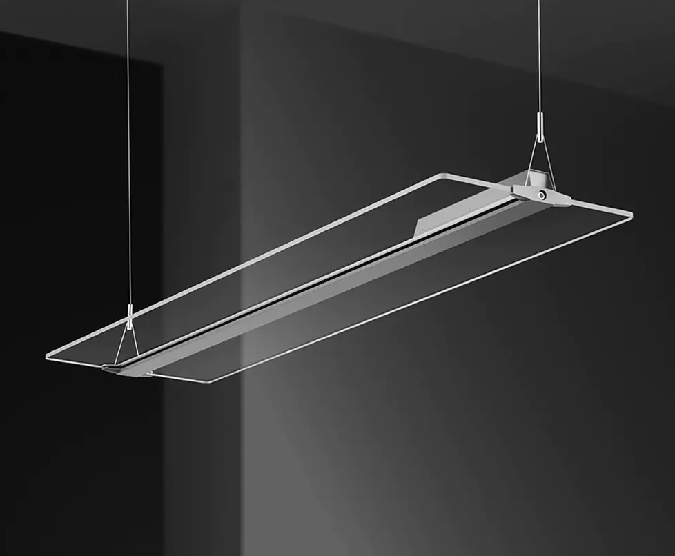
We found this incredible fixture, the X32 Clear Panel for inside our meeting rooms, phone rooms, really any room that was going to have a closed door on it. It’s sleek, throws really nice light in all directions, and is easy to mount either nearly flush with a ceiling or, if you have the height to support it, suspended at a comfortable height. We get a ton of compliments on these fixtures.

Bonus: they’re also only ~$120 US a piece. The only downside (and it’s a big one) is you have to order them in minimum of 10 units, and they’re coming directly from a supplier in China so it’s going to take a few weeks minimum AND shipping can get expensive. Thankfully, I was ordering enough (and early enough) to make it worthwhile.
GLOWY LIGHTS LOOK COOL BUT SUCK FOR SEEING.
When choosing color temperatures, I tried to get fixtures that were on the cool end of warm, more like residential bulbs.
3000k-3500k tended to give the best color, more feeling like natural sunlight without being too “glowy.” 4k seems to be more “popular” in office settings but in our tests it always felt too cold and sharp.
At the same time, I learned that these numbers aren’t super consistent across manufacturers. When possible, try to get sample fixtures and test them in the real setting, mixed with whatever natural light you’re working with.
Lesson #2: Track lights work really well “upside down” if you have a light colored ceiling
Originally, we installed all of our track heads the way you’re used to seeing them: pointed down and at an angle.

The trouble we hadn’t anticipated was how often a light would end up pointed directly in somebody’s face. We tried tweaking track positions, but avoiding one person’s eyes almost always meant pointing them into someone else’s eyes.
The other problem was that – and this might sound obvious but bear with me – lights work best when they have something to reflect off of.
The “shadow” problems that people often get with track lights are a symptom of direct lighting.
We generally try to avoid direct lighting because it’s harsh (especially with glossy computer screens). The ideal balance is for the space to appear bright, but without any primary work areas work areas (desks, etc) feeling like they were under a spotlight.
We tried filters and gels, too, but learned that the most effective technique for track head positioning was to make sure that our track fixtures were directed at a nearby surface: a wall, a column, a beam, ductwork…any surface that would help distribute the light to the surrounding areas. Like this example, in our gallery space, which shows the lights pointed at the walls.
By pointing fixtures at the walls, the surrounding areas are cast in a very comfortable indirect light. That seems to be the key.
The trouble we ran into with our space was that in so much of our space, the “walls” are just our windows to the outside world. They’re great for letting natural light in (and we have 300+ feet of giant windows letting in lots of natural light) but pointing lights at those windows looks horrible. They’d just shine the direct light back into someone’s eyes, and do very little to actually light the space.
So one of our members had an idea that was just crazy enough to work. We decided to flip the tracks upside down so we could point the fixtures at our ceiling. Like this.
There’s those giant windows. Note that this photo was taken on my iPhone and does a terrible job of showing the light quality itself, so I’m only including it to reference the track head position we use.
By treating our ceiling like another wall (we’d already painted it a bright color to reflect the natural light), and now we’re able to get the same general effect of LOTS of bright but soft, indirect lighting covering almost every area of workspace. Nobody has to work under a spotlight. Success.
When we expanded our space in October, we took the same approach of flipping the tracks from the start. The electricians looked at us a little funny when I asked for it, but after it was in even they commented how nice it looked.
How much to budget for lighting
These numbers are rough, but if I reverse engineer our lighting budget from the overall project fit-out….
Total Electrical Budget
We spent ~$7.50 per square foot on all of our electrical work, which was almost entirely brand new (new wiring, power sockets, breaker panels, lighting fixtures, switches….everything with power running through it was basically brand new.
Lighting Budget
Approx 25% of the electrical budget was lighting fixtures.
That included tracks + LED track heads as our primary light source, accent lighting, and special fixtures for inside our meeting rooms. So that maths out to apprx $1.80/square foot on light fixtures alone.
Note that this number doesn’t include installation, wiring, switches, etc._
Also keep in mind, that’s with all LED fixtures, which are often appear 2-3x more $$$ up front but save a boatload in energy costs and you basically never need to buy another bulb (which, in our old space, we spent several hundred dollars a year on replacement bulbs for various non LED fixtures). YMMV, of course, but stacking this number against other lighting upgrade projects I’ve seen and done…it seems about right, plus/minus 10%.
Whew. That’s a lot, and kind of all over the place. But hopefully it helps you think through the decisions you need to make, which will include:
- how to light for experience, not just function
- how to “layer” different fixtures to help indicate zones and uses
- making use of your existing tracks (or adding more of them to give you max flexibility)
- choosing fixtures, and finding ways to save $$
- using your constraints
If I can help more one-on-one, feel free to shoot me an email.

 I am always thinking about the intersection of people, relationships, trust and business. I founded